Please note : This help page is not for the latest version of Enterprise Architect. The latest help can be found here.
BPSim Charts
The Artifacts page of the Diagram Toolbox provides two icons specifically to generate charts that reflect selected results from BPSim simulations. These are:
- BPSim Result Chart - to generate a Chart that reflects selected results from a series of standard BPSim simulations
- BPSim Custom Result Chart - to generate a Chart that reflects results from a series of customized BPSim simulations
As for other Chart Artifacts, both BPSim Chart types can be quickly configured to display the simulation results in variations of a line chart, two-dimensional bar chart or 3-dimensional bar chart.
Prerequisites
To populate the Charts created from the BPSim Artifacts, you select the Result Artifacts created during the simulation of each configuration that you want to show. Therefore, the initial simulations must be performed first, and the Report Artifacts generated.
Access Open a diagram | Main Menu - Diagram | Toolbox > Artifacts | Drag the BPSim <type> Chart Artifact icon onto the diagram
The BPSim<type>Chart element displays on the diagram; double-click on the element
Select Results to Display In Chart
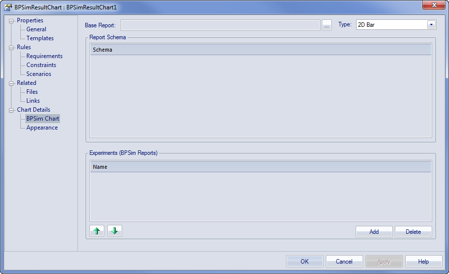
Complete the fields on the 'BPSim Chart' page of the Chart 'Properties' dialog.
Field/Option |
Action |
See also |
|---|---|---|
|
Base Report |
Click on the |
|
|
Type |
Click on the drop-down arrow and select the format type of the Chart in which to display the results - 2D Bar, 3D Bar or Line. After you have specified the report parameters to compare, you can select the 'Appearances' page of the dialog and define the appearance of the bar chart or Time line graph. |
3D Bar Chart Time Series Chart 2D Bar Chart |
|
Report Schema |
Expand the hierarchy as necessary and select the checkbox against each property to display on the chart. Each property will be represented by a separate line or group of bars on the chart. Usually you would select similar objects (such as different resources) and the same single property for each object (such as the degree of utilization of the resource). You have a wealth of properties to examine and compare, but any more than a couple on the same chart makes the chart hard to read. |
|
|
Experiments (BPSim Reports) |
This panel lists the simulation report results (as BPSim Result Artifacts) that you have selected to compare using the chart, in the sequence in which their selected parameter will be shown on the Chart. Usually, the Base Report remains as first in the list and the result for its parameter is shown at the left of the Chart. If you want to change the sequence, click on the Result Artifact name and click on the appropriate . To add further Result Artifact names to the list, click on the and browse for and select the Artifact from the 'Select <<BPSimReport>> Artifact' dialog. |
 button to display the 'Select <<BPSimReport>>Artifact' dialog, and select the report Artifact for the simulation results against which other simulation results will be compared. This Results Artifact is also added to the 'Experiments' panel as the first in the list of report results to be compared.
Learn more


